


Designing an Interactive Campaign
Reporting Dashboard
Brief
Our customers (financial institutions) run marketing campaigns for their cardholders by sending them offers where they can earn additional points or cash back. At the time we were sending out reports on these campaigns via spreadsheets and presentation decks.
Our vision was a self service dashboard that visualized the impact of campaigns.
Role
UX, UI, User Interviews, Problem Exploration
Team
Visual Designer, 2 UX Designers, Copywriter, 1 Developer
Timeline
8 weeks for design including usability
Goal: Redesign the tool to make it a self serve tool, empowering our users to make marketing decisions without waiting on custom analytics requests. An added benefit would allow more frequent access to reporting, allowing them to shift strategies more frequently to optimize for their goals at more granular level.
Typical User Flow
- 1
Run
campaign - 2
View
results - 3
Decide on next campaigns - 4
Determine if meeting goals

Visual representation of a dashboard
Process

Heuristic Evaluation &
Problem Exploration
We talked to analytics and the account team to get an idea of the way the problem was currently being solved. We also did a deep dive of the current reporting.

User
Interviews
We talked to financial institutions of various sizes to better understand their current reporting experience and how it fits into the larger picture.

Initial
Wires
We created wires of the proposed interactions and data visualizations to present to the internal team, get their feedback and iterate.

Usability
Study
We developed a high fidelity interactive prototype to ensure users could interact with the graphs and interpret them.

Visual
Design
We worked on finalizing the visuals to be pixel perfect and allow for branding of the dashboard

Functional
Specifications
We wrote the specs based on the final design

Implementation
Pending
We handed offed the details specifications, along with the final visual design the developers in Invision for implementation.

Design Reviews
Pending
Once the first iteration is implemented we will review the results for total quality control.
Results
- The final design was received with excitement from our users and a high self reported rating. Users claimed it would help them make better decisions and would solve a major pain point.
- The dashboard is the first many of projects to be extended to enable automated reporting across the company for our clients, sales, client team and more.
Want to know more about this and other client projects?
Case Studies
Private Portfolio
Some of my best work across six years of UX.
UX / Usability / Strategy / Product
View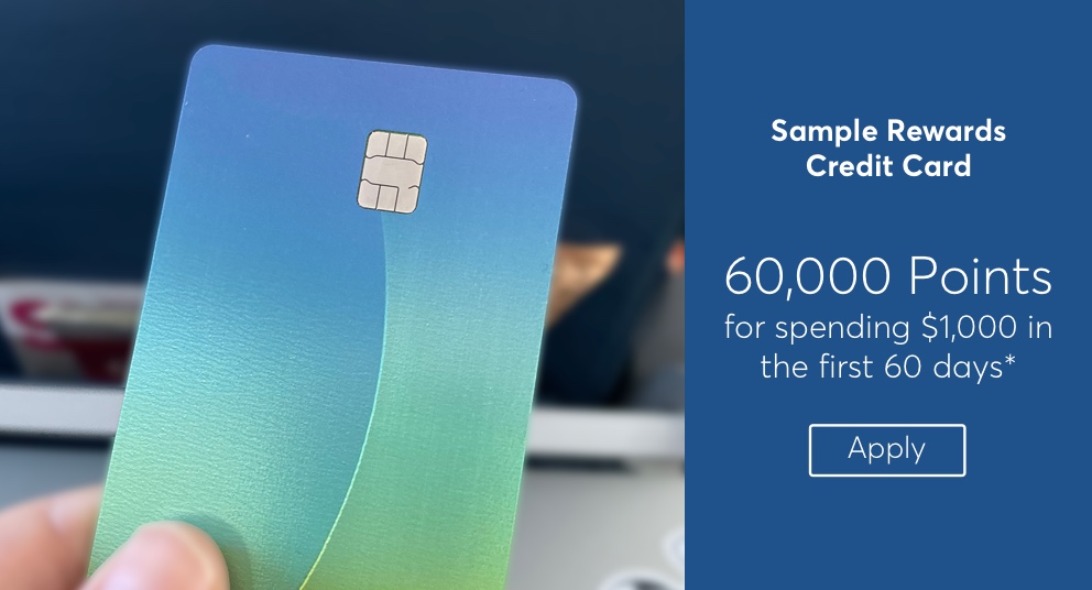
Enterprise Configuration Tool
The redesign of an enterprise tool resulted in more confidence and less confusion from users.
UX / Usability / HTML Prototype / Visual
View
Consumer Credit Rewards
This site redesign for a major financial institution uncovered interactions improvements and the need for more onboarding to re-iterate of the overall value prop to cardholders.
UX / Usability / Accessibility / HTML Prototype / Visual
View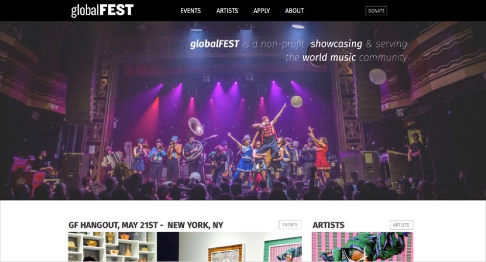
globalFEST Redesign
globalFEST has become one of the most dynamic global music platforms in North America. This redesign gave the brand the prestige they deserve while greatly improving usability.
UX / User Interviews / Usability / Visual
View
Design Process
I follow a data driven flexible process to develop solutions that resonate with customers.
View