


Redesigning a Bank Loyalty Site
Brief
The goal of a bank loyalty program is to drive consumers to spend more with a certain credit card, creating a habit that makes their card the “top of wallet”. Users can earn additional points or cash back by shopping through our loyalty site. For example: a user could earn 10% cash back by shopping at a certain retailer.
Typical User Flow

The resulted after the client performed heuristic analysis of the entire loyalty experience and wanted to fix certain items along with previously identified issues through customer support and executive leadership.
Role
UX, UI, Client Management, HTML Prototyper
Team
Visual Designer, 2 UX Designers, Copywriter, Account Manager, 2 Developers
Timeline
8 weeks for design
2 weeks for HTML Prototype
Goal: Redesign the site to make it more usable and intuitive: reducing user friction, increasing engagement and perceived value.
Process

Heuristic
Analysis
Client performed heuristic analysis and made suggestions for the site

High Level
Requirements
We collaborated on the suggestions using UX best practices, competitive analysis, and our internal expertise to develop requirements

Initial
Wires
We created wires based on the agreed upon requirements considering technical feasibility and experience impact

Usability
Study
We proposed a 10 user, 2 week usability study, iterated on the design, increasing perceived value and optimizing the IA

Visual
Design
Client was very happy with the design relationship with client improved, leading to other opportunities

Functional
Specifications
We wrote the specs using the results from the usability testing and best practices, continuing the theme of max perceived value.

Implementation
I provided an HTML prototype, worked with the developers on the implementation the experience to ensure top quality, including accessibility.
High Level
Requirements
The client performed heuristic analysis, identified areas of opportunity and came up with a list of requirements for the redesign. We went through the list with the client to understand each request deeply. Most requests were concerned with the mobile experience and navigation. Our intention was to increase the program's apparent value and to make it more usable.
Over multiple sessions, we finessed the requirements based on: technical feasibility, impact on the user experience, competitive analysis, our internal expertise and the time-line requested. Although it is not ideal to decide upon requirements before design, we had to use this process as it was comfortable for the client (we did sketches on the side). We agreed the requirements could change if needed.
Initial Grayscale Wires
We used our competitive analysis of major e-commerce sites and other loyalty sites to get a feel for what users were expecting and created the wires. We then took the requirements and decided to wire frame the screens that were most critical: what was changing and what was in the user's critical path.
Once the wires for desktop and mobile were completed and approved, we proposed a small usability test to ensure that the design was actually better than the new site. We explained how risky it would be to only base the design on heuristic analysis and our opinions, the client agreed.
Usability Testing
Because of the limited budget and project deadline, we proposed to use everyone's social network for usability test participants with varying levels of technical and banking confidence. We quickly created an email that was sent out and scheduled the participants.
The test consisted of 4 rounds:
- Round 1: Desktop
- Round 2: Mobile with findings from round 1
- Round 3: Desktop with findings from round 1,2
- Round 4: Mobile with findings from round 1,2,3
By staggering the usability tests like this were able to test both mobile and desktop in a short amount of time. We fixed and identified various issues with the new site, but the most interesting finding was users’ different understanding of the underlying program, value prop, which we fixed by adding onboarding at various touch points.
As expected, requirements changed due to the usability testing. We presented the findings and designs to the executive team who were very excited about the design and risks avoided.

Visual Design
We followed the branding guidelines and toolkit, taking the wires and applying color. We collaborated with the client's product manager on things that did not meet their guidelines entirely but helped create a stronger visual hierarchy.
Functional Specs
We wrote functional specs based on final visual design and usability testing. We took great care to leave them generic enough that that could be interpreted in more than one way should we uncover more technical feasibility issues during the build (we always do).
Implementation
We developed an HTML prototype that the developers could use for their implementation. Once it was coded, I worked closely with the developers ensuring the design not only met the functional specs, but had the intended outcome of the redesign, and met all accessibility standards.
We successfully implemented all designed features and launched. We added advanced analytics to help inform further changes.
Retrospective
- Collaboration
The process could have been made better if there was more collaboration between the parties in charge of doing heuristic analysis and the design team at Affinity. - Usability Testing
We should have also involved developers in the usability testing to get more buy-in about the “complicated” technical challenges in meeting today’s consumer expectations for e-commerce sorting, searching and filtering. - Selling Design
In cases when requirements were being confused by developers and the client, we could have created additional clickable prototypes or user flows to increase clarity.
Want to know more about this and other client projects?
Case Studies
Private Portfolio
Some of my best work across nine years of UX.
UX / Usability / Strategy / Product
Contact Me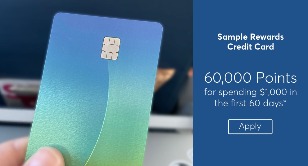
Enterprise Configuration Tool
The redesign of an enterprise tool resulted in more confidence and less confusion from users.
UX / Usability / HTML Prototype / Visual
View
Enterprise Reporting Dashboard
The design of a new campaign reporting dashboard to enable better marketing decisions was well received by users.
UX / Visual / User Interviews / Usability
View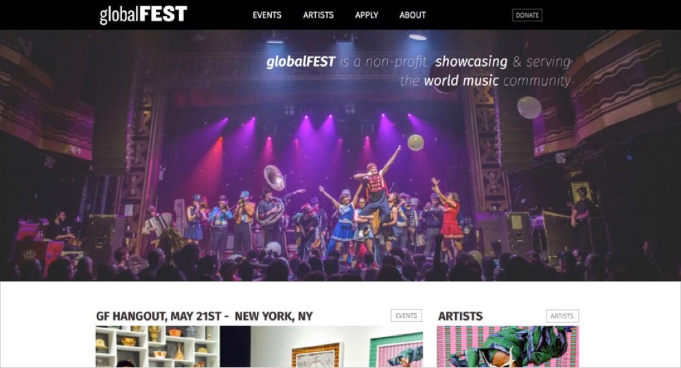
globalFEST Redesign
globalFEST has become one of the most dynamic global music platforms in North America. This redesign gave the brand the prestige they deserve while greatly improving usability.
UX / User Interviews / Usability / Visual
View