


globalFEST: Music Festival Redesign
Brief
The globalFEST’s website needed to reflect the prestige, industry credibility and the growing role it plays in supporting and exposing the world music community. The old globalFEST website followed dated design patterns and its information architecture was confusing to users.
Goal
Get more users, infiltrate the market and provide easier access to information.

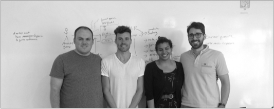
Team: Me, Keith, Andres
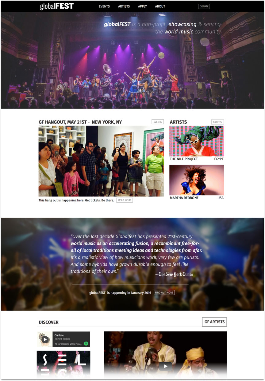
Final Mockup: Home Page
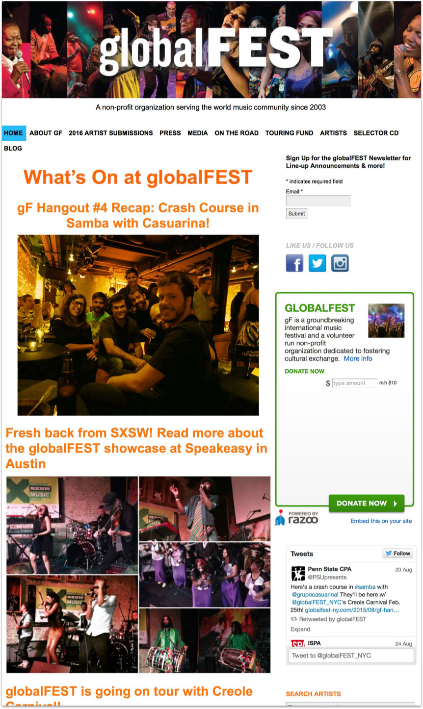
Analysis of Current Site
At first glance we could tell that the site had various usability issues, however we verified this by doing usability tests and analyzing the content.
User Comprehension of Site
- Only 3 of 9 non-industry users could correctly identify what globalFEST was based on the site.
- globalFEST was explained differently on different pages, in more than 5 different ways.
Usability Testing
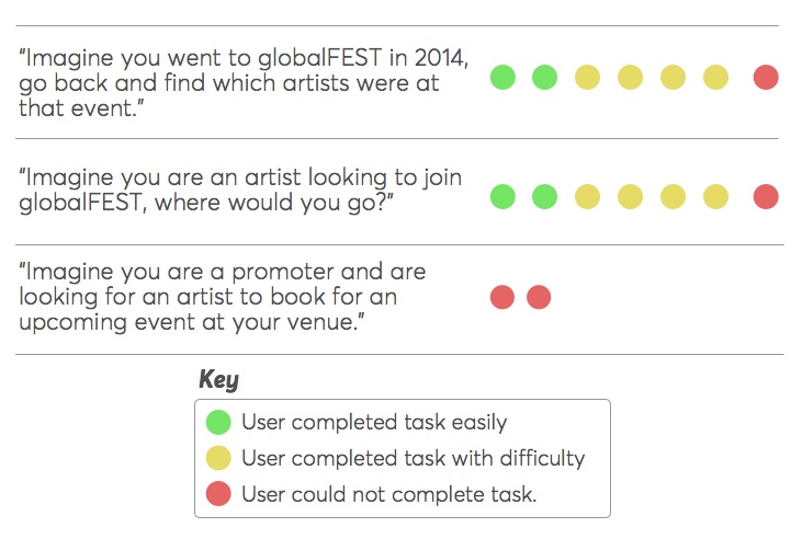
Users had a lot of trouble finding basic information on the site and identifying what globalFEST does.
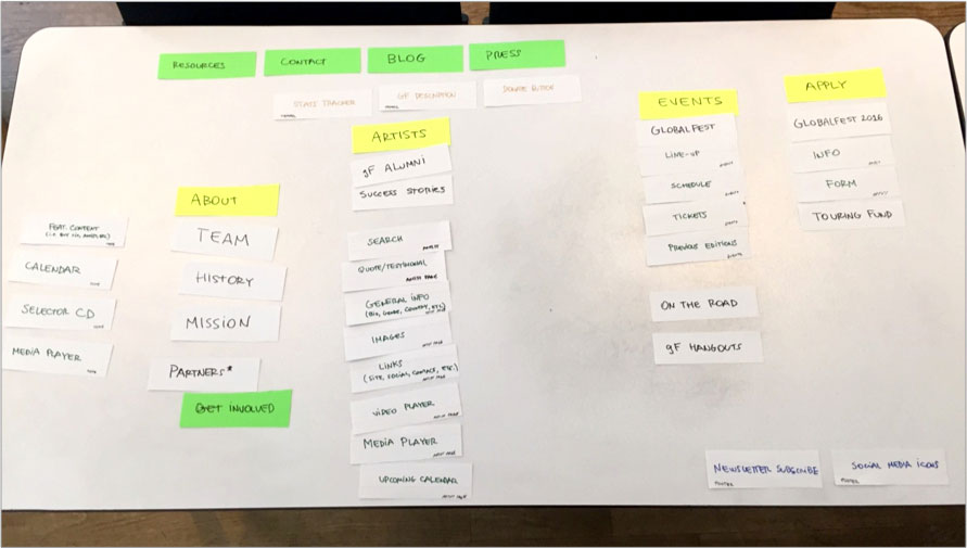
Co-Design
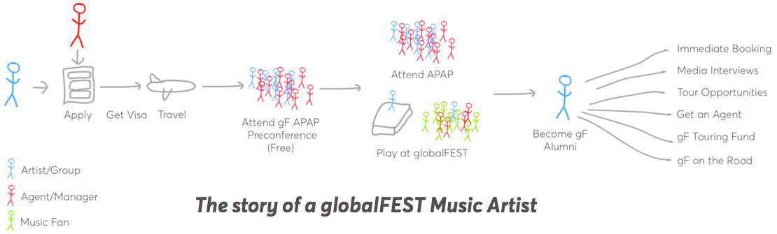
We met with the globalFEST team to co-design the best Information Architecture. We started by looking at the journey of a globalFEST artist. With that in mind, we prioritized the content and ensured the IA reflected the various components of globalFEST while remaining simple enough to navigate.
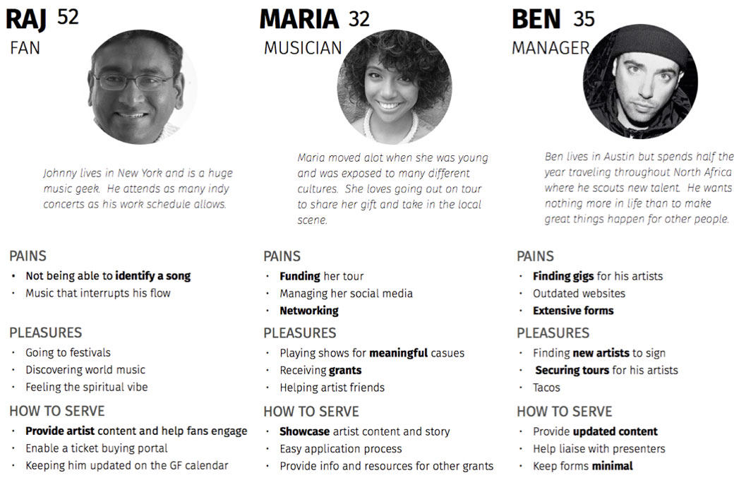
User Research
We interviewed users in and outside of the globalFEST community, ensuring that people's praise and appreciation of globalFEST did not bias them to minimize their pain points, especially for artists.
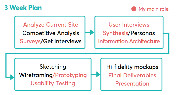
Iterations—Home Page
To ensure that the home page highlighted the right content, we started by wire-framing the “deepest” pages first and working back to the home page. We brought frequently updated content forward to the home page, keeping it fresh and providing immediate access.

Design Notes
- Explain the main thing globalFEST does
- Find out more about gF
- Explain the secondary things gF does
- More of what gF does
- Media from artists
- Footer navigation
- Strategy change: we show what gF is through content/images, not words so users can better understand what gF is.
- Most recent events, keeping the home page fresh.
- Featured artists of the week
- Credibility from the New York Times showcasing it’s reputation
- Link to view all artists added
Iterations—Events Page
Events are a crucial part of globalFEST, by making 'Events' go to a landing page, we helped show other events besides the annual festival, keeping globalFEST relevant year round.
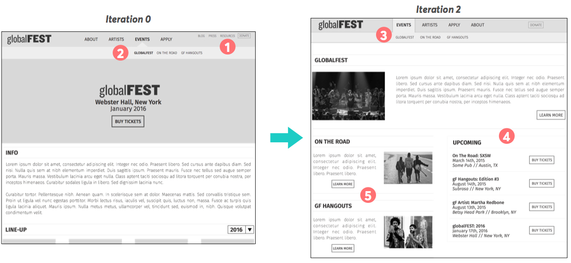
Design Notes
- Unimportant links moved to footer to reduce number of options in navigation
- Elements re-ordered to represent the core of gF. Also “EVENTS” now goes to a landing page
- Left aligned secondary navigation for visual balance
- Upcoming events keep the page fresh
- Explanation of different events
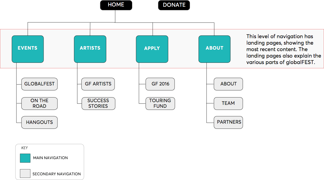
Final Site Map
The navigation allows users to not only find the information they need but also to understand the essence of what globalFEST is about: Events and Artists.
Final Results
Usability Tests Improvement
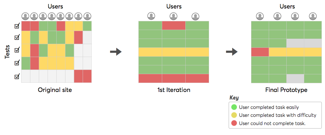
The usability of the site was greatly increased. Users understood globalFEST and how to find the information they need.
Final Recommendations
- Create a visual brand guideline. Then take that brand and apply to the website.
- Create the content first. Try to create a consistent message about what gF is.
- Keep using WordPress as it’s easy to update content.
- Analytics should be used to see the paths users are taking in the site once it goes live. This can be combined with usability testing to make the design even better.
Want to know more about this and other client projects?
Case Studies
Private Portfolio
Some of my best work across nine years of UX.
UX / Usability / Strategy / Product
Contact Me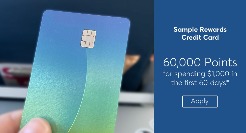
Enterprise Configuration Tool
The redesign of an enterprise tool resulted in more confidence and less confusion from users.
UX / Usability / HTML Prototype / Visual
View
Enterprise Reporting Dashboard
The design of a new campaign reporting dashboard to enable better marketing decisions was well received by users.
UX / Visual / User Interviews / Usability
View
Consumer Credit Rewards
This site redesign for a major financial institution uncovered interactions improvements and the need for more onboarding to re-iterate of the overall value prop to cardholders.
UX / Usability / Accessibility / HTML Prototype / Visual
View