Redesigning an Enterprise Offer Creation Tool
Brief
This enterprise tool allows banks to configure offers for their cardholders. The tool was outdated and had various usability issues, causing users to call or email in for their offers to be checked by a human. Users had a lot of fear from using the tool, as making the wrong choice could cost them a lot of money.
Our vision was a "set it and forget it" like experience.
Role
UX, UI, Client Management, HTML Prototyper
Team
Visual Designer, 2 UX Designers, Copywriter, Account Manager, 1 Developer
Timeline
8 weeks for design including usability
Goal: Redesign the tool to make it a self serve tool thereby reducing the amount of customer service requests and increasing users' trust, promoting them to create more offers and get more value out of the loyalty program overall.
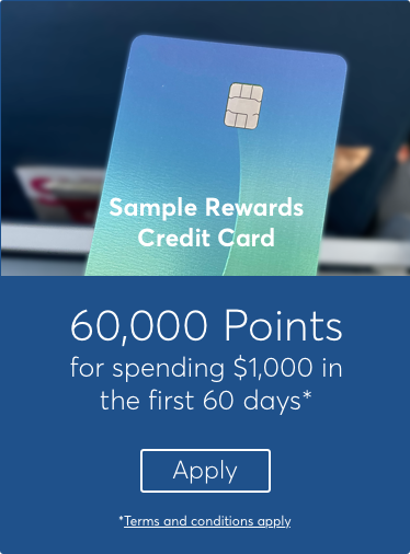
Sample marketing for an offer
Process

Heuristic Evaluation &
Problem Exploration
We talked to customer support and analyzed the design to determine the best areas for improvement

Initial
Wires
We created wires based on the agreed upon areas of improvement considering technical feasibility and experience impact

Usability
Study
We tested the design with 3 target users in 2 rounds with an HTML prototype. We identified interaction issues, user's language and user's mental models along the way.

Visual
Design
We then applied visual design and all of the updated copy from the usability.

Functional
Specifications
We wrote the specs using the results from the usability testing and technical feasibility to meet the deadline.

Implementation
We handed offed the details specifications, rough HTML prototype to the developers in Invision for implementation.

Design Reviews
Once the site was coded, we reviewed the visual design and interaction to ensure it met our specifications
Results
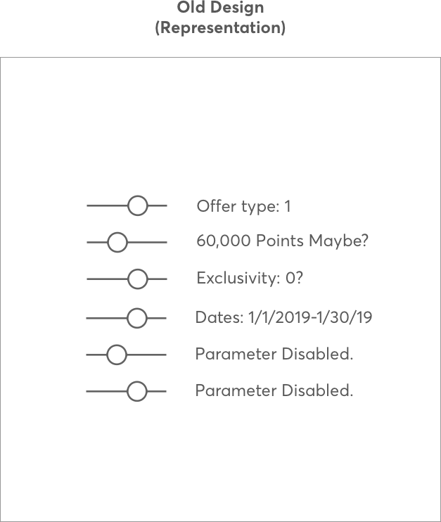
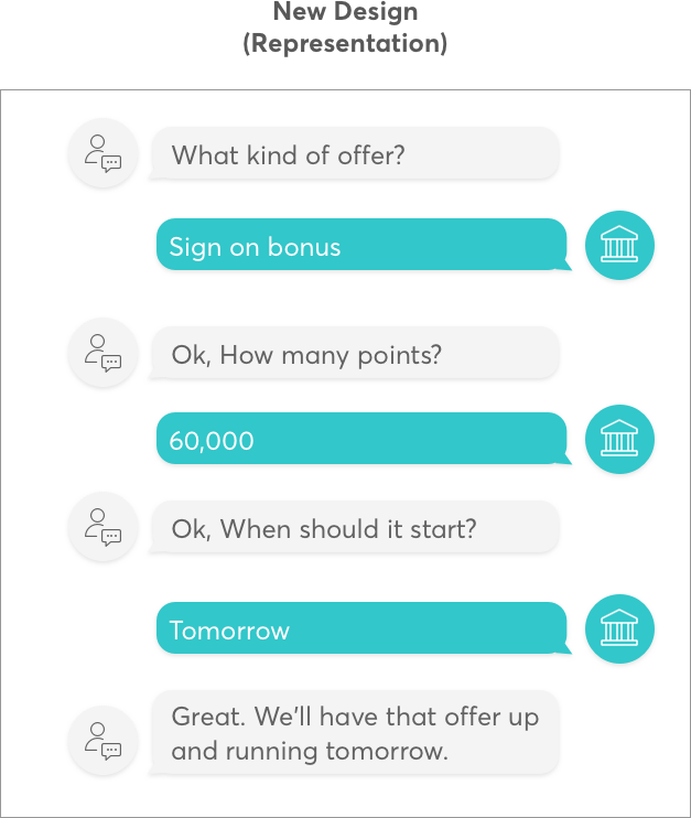
- The client executive team was very happy with the design and approach. This is the first step in enabling their longer term vision for a usable self service tool enabling smaller financial institutions to be more competitive and bring their card to the top of wallet.
- The new design guided users to create an offer in their own language and mental model rather than the users having to configure 'database' fields
- We iterated on our design until it was very easy to use, and users had much more confidence in creating offers.
- Users had much less fear and were more excited with the final version of the tool


