UX Process & Tools
I start any project by aligning with key stakeholders on the project goals and current set of assumptions. The stakeholders and I co-create this mural and keep it up-to-date over time to ensure alignment.
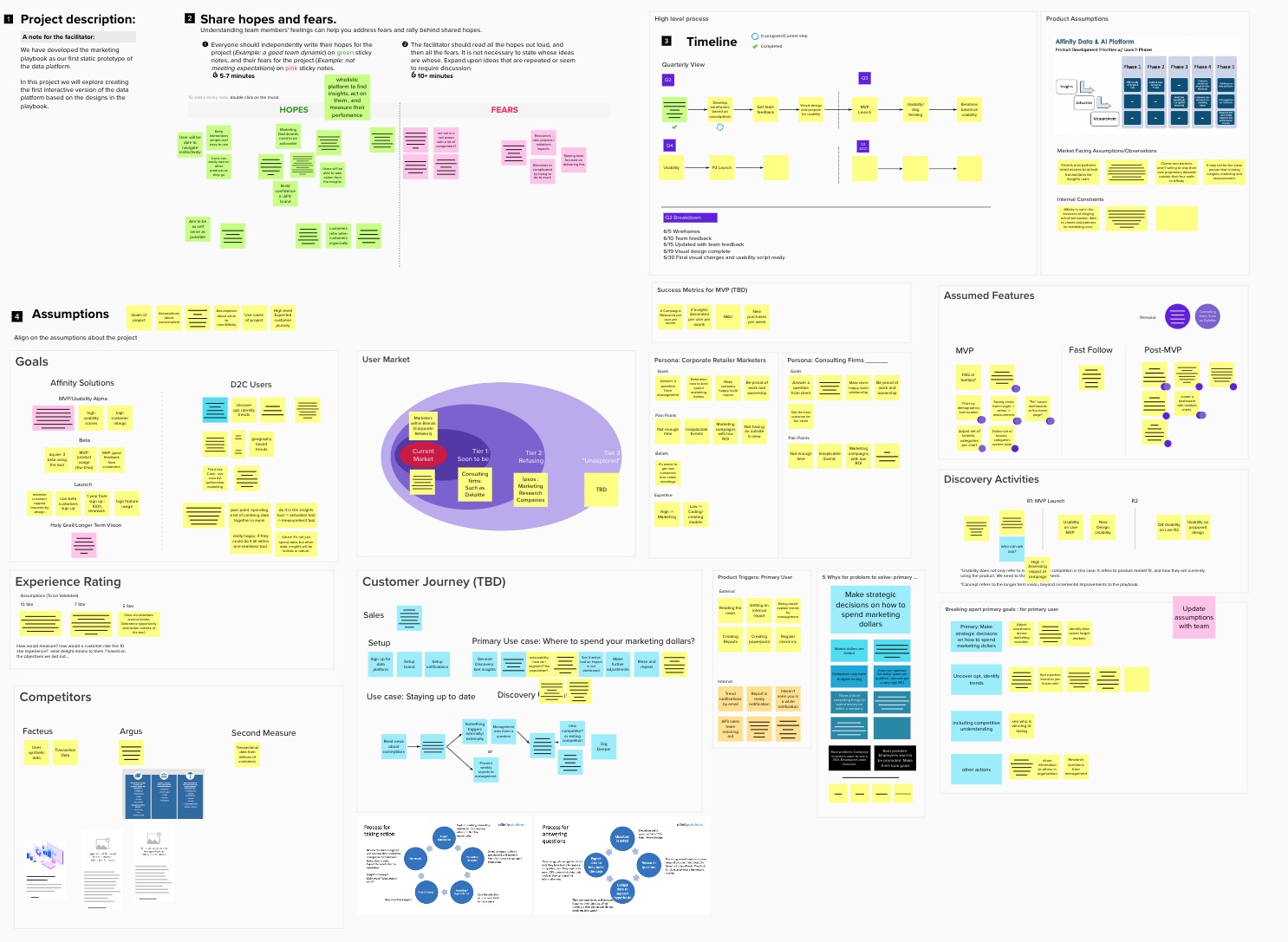
Once the assumptions are understood in depth, I map out the best process given the information and constraints we have at the time.
For example: some projects may only require usability, while others may require a deeper understanding of users in order to be most effective.
In any case using discovery to validate our assumptions is key to create designs that will be adopted and drive value for the business and for users.
Below is the typical double diamond process
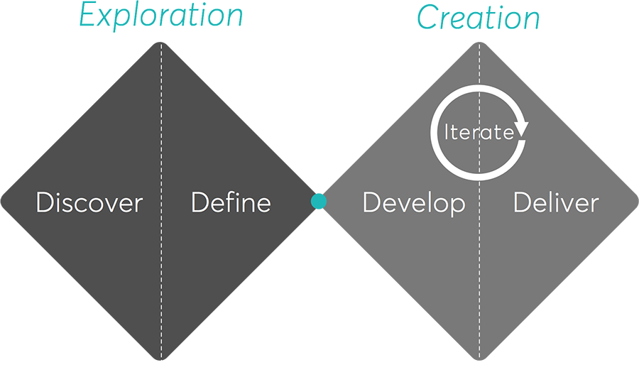
Discover
Explore the problem space closely.
TECHNIQUES
- Brief Alignment
- User Interviews
- Empathy Mapping
- Contextual Inquiry
- Problem Exploration
- Competitive Analysis
Define
Apply constraints to determine what part of problem matters the most and is feasible to solve.
TECHNIQUES
- Concept Prioritization
- Concept Feasibility Analysis
- Tech Feasibility Analysis
- Gut check
- Personas
Develop
Apply constraints to determine what part of problem matters the most and is feasible to solve.
TECHNIQUES
- Feature Prioritization
- Feature Feasibility Analysis
- Sketching
- Design Studio
- Prototyping
- Usability Testing
- Co-Designing
Deliver
Finalize deliverables, re-validate assumptions, final testing (ensuring implementation meets design).
TECHNIQUES
- High fidelity mockups
- Interaction Specifications
- Final testing
- Experience Walkthrough
Tools
Pen & Paper
Sketch
HTML/CSS
Confluence & Jira
Invision
Axure
Photoshop
Mural
Market & Competitive Analysis
I analyze the competitors to understand market trends, see how the product differs, and find potential opportunities. This analysis helps me understand where the product stands in the market and how users are currently solving the problem at hand.
Navigation Comparison
If a site is designed correctly, the navigation can resemble the assumed user mental model of site. In the example below, Walmart assumes that people group together dairy, eggs and cheese as they would be physically close in the supermarket. However, if you are trying to change users' perception, a unexpected navigation may be the way to go.

Navigation comparison for grocery items
Feature Comparison
Looking at what features competitors have tells us areas of opportunities and what differentiates us from others doing differently. This is a baseline for what features people expect.
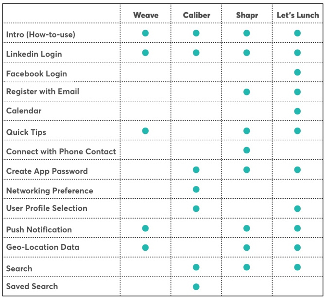
Selected features for location based networking apps
User Flow Comparison
Competitor user flows gives an idea of how users current accomplish their tasks on the websites, and again areas of opportunity.

Buying A Product Online - D’Agostino

Buying A Product Online - Whole Foods
User Research
Great user research is the key to great UX. Conducting user interviews and usability is the best way to empathize with users and stakeholders. It is really enjoyable and addicting to learn about people and how they think.

Problem Exploration
Before doing user research we explore the problem/ brief in various dimensions using Mona Patel’s version of exploration. This allows me to think about the problem in different ways, why the problem is there, what it means to solve the problem, and what is stopping us from solving the problem. This exploration provides insights into what areas should be explored during user research. It can also align teams as to what the problem is, or showcase the need for discovery to validate the "root problem".
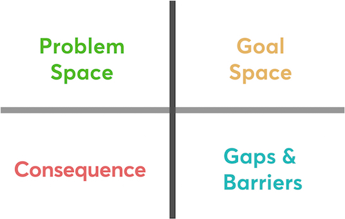
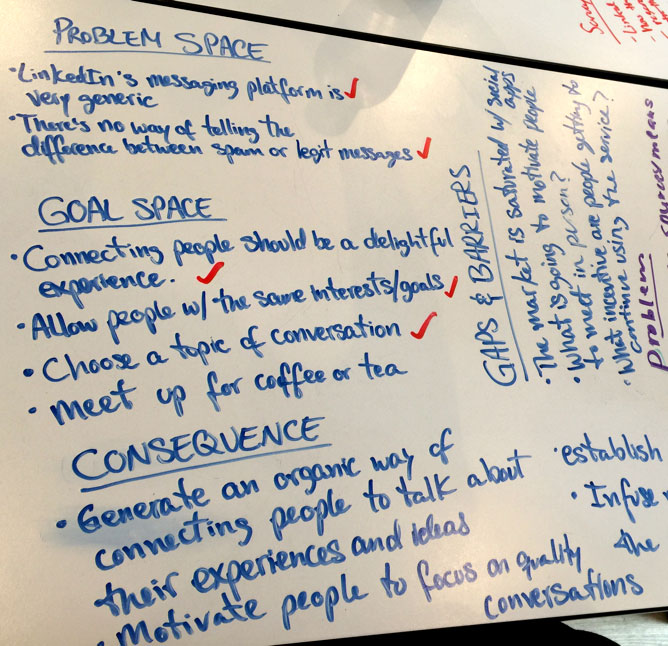
Empathy Mapping
Collaborating with empathy mapping in a setting allows everyone to come to an agreement to the assumptions we are making about users before we do research or design.
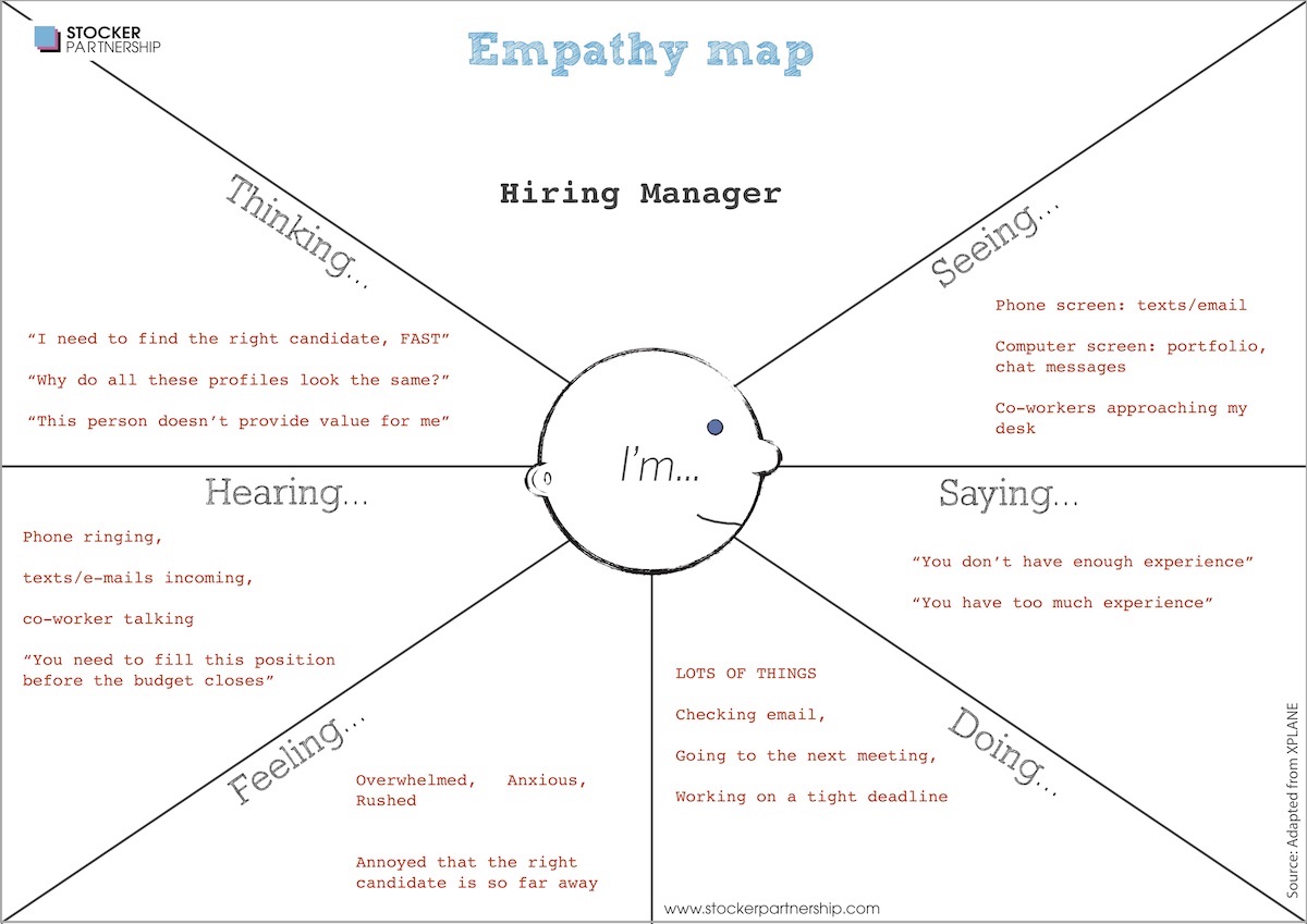
Preliminary empathy map of a hiring manager (maybe you?)
User Interviews
After creating an interview outline I create a list of questions to ask. I also inquire about the surrounding context of these behaviors. Paying attention to the tone of voice and body language I let them speak and listen to what is said and not being said. Getting into the mindset of users is key for designing for them.
- General Behaviors
- Good & Bad Networking Experiences
- Meet New Friends & Stay in Touch
- Mentoring & Career Growth
Interviews are the main source of user empathy
Synthesizing Research
We synthesize the research by doing affinity mapping, grouping like clusters. It's helpful to group findings in the 6 minds of user experience design.
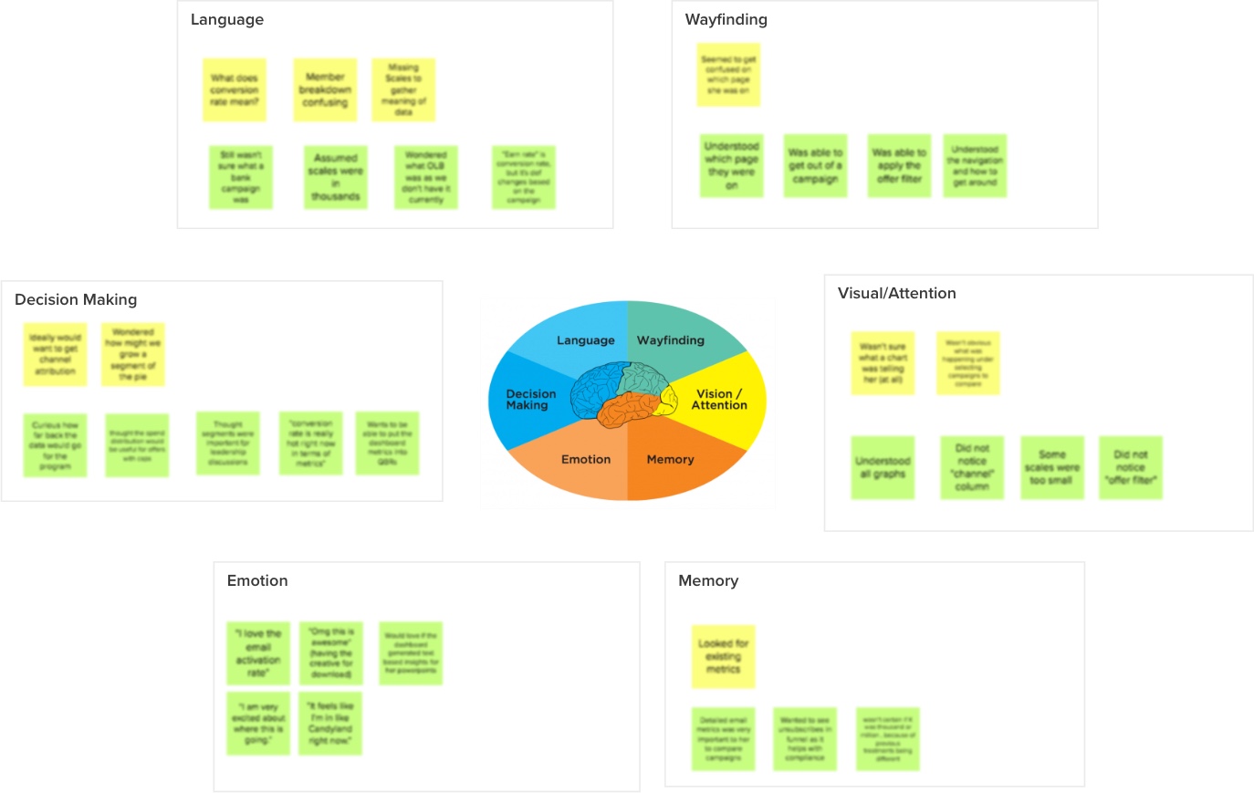
User research results grouped in 6 minds (blurred due to NDA)
Personas
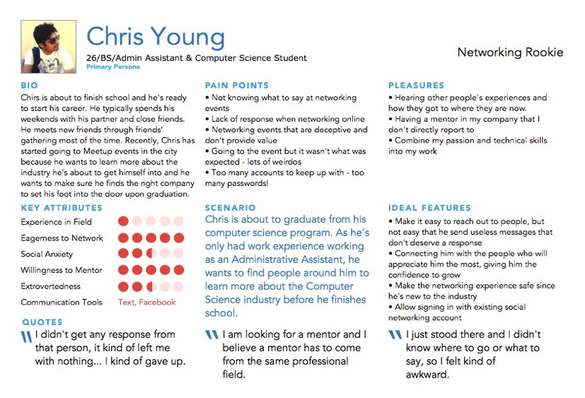
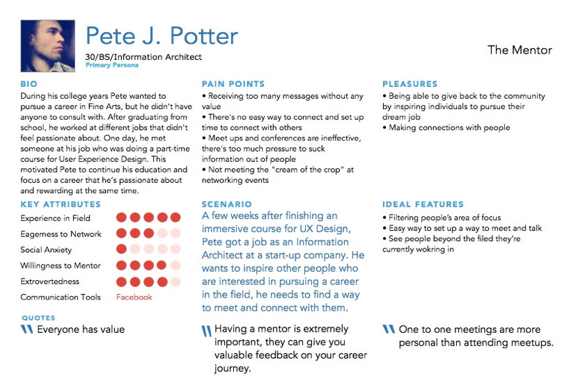
Personas are a great tool to help create empathy for the user for all parties involved but aren't always necessary.
Usability Testing
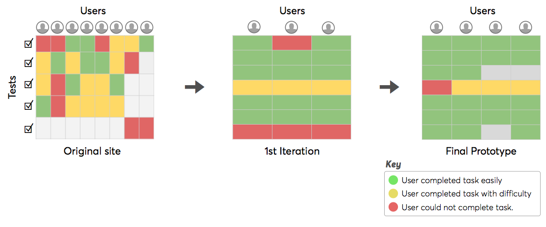
Usability testing is used to understand the design from various perspectives such as: visual, language and interactions. Usability tests do not confirm if users want to use your product, or what they would really do in the context of their lives unless done in the right setting. It is used to triangulate with user interviews, analytics and other sources to make less riskier design decisions.
Sketching & Wireframing
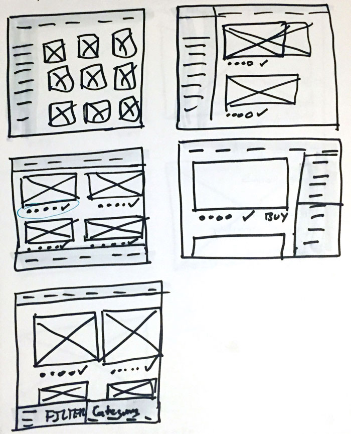
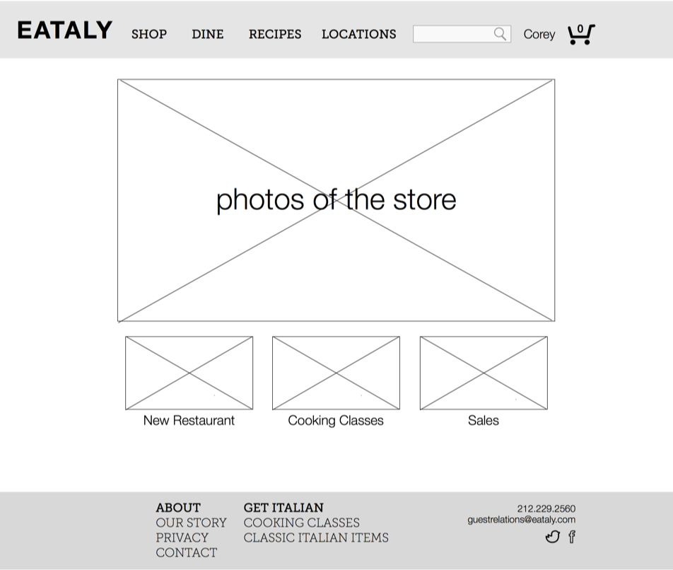
Sketching and wireframing allows for fast iteration and critique to decide on a general design concept, this can be done along with design studio to focus the team on the user and goals and make decisions.


